Release 7.0 - We Accidentally Built Dark Mode
 PK
PKPeter Klimek
We didn't plan to build dark mode.
It was on the list — somewhere around item 47, between "nice to have" and "maybe someday." Users had been asking for it for years, and we always nodded and said we'd get to it. We meant it. We just had other things to build first.
Then we started working on some major dependency upgrades for 7.0.
How it happened
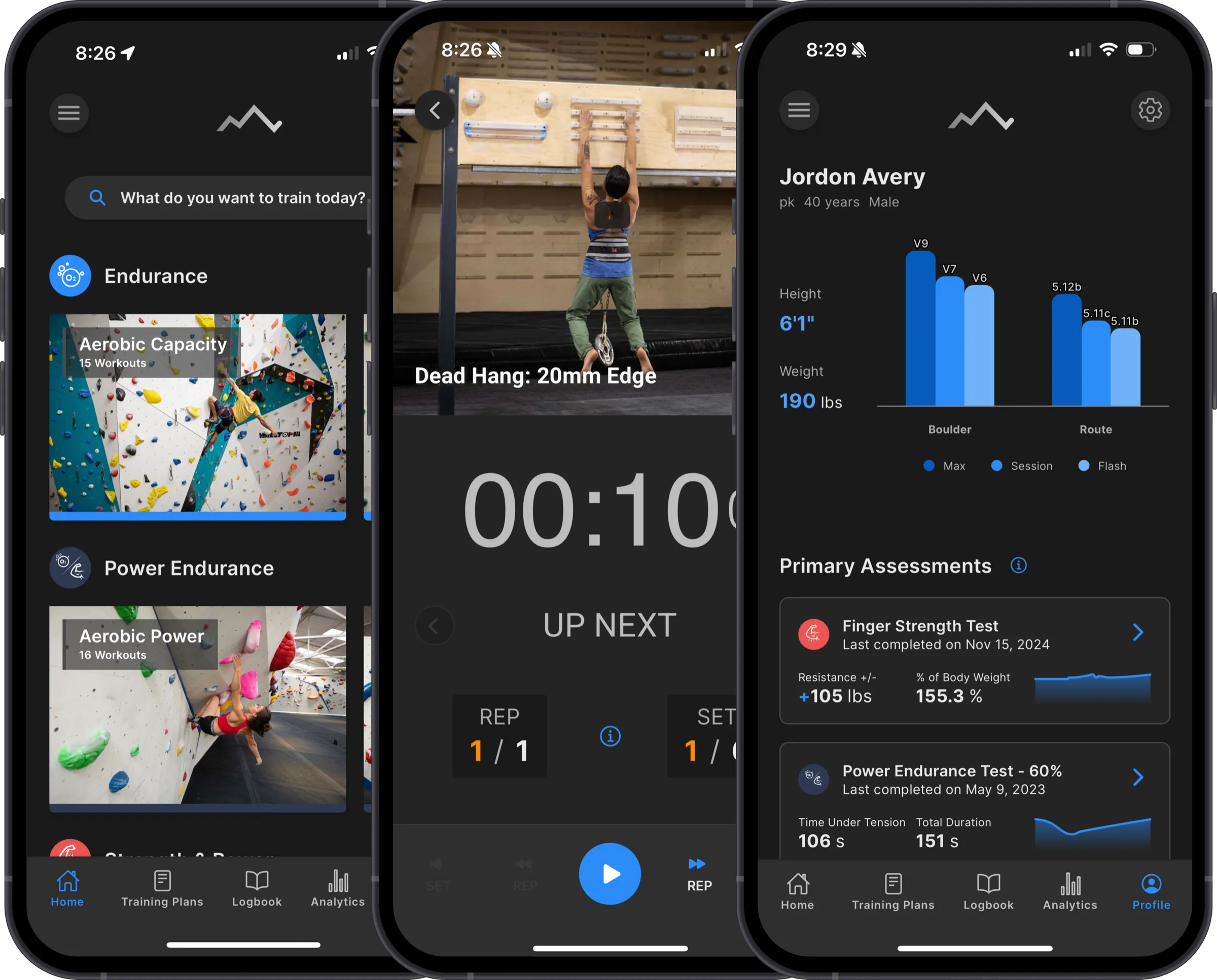
The original Crimpd UI was built incrementally over many years. Colors were hardcoded in dozens of places, spacing was inconsistent, and every screen had its own slightly different idea of what a card or a button should look like. It worked, but it was brittle.
For 7.0, we wanted to clean that up — proper design tokens, consistent typography, a unified component library where a button looks like a button (mostly) everywhere. That meant pulling all the hardcoded color values out and replacing them with a semantic token system that the entire app references.
Once we did that, dark mode was just... a second set of tokens. We hadn't set out to build it, but the infrastructure work made it almost trivial. So we built out a dark palette, polished it, and here we are.
It's shipping as a beta. There are still edge cases we're catching — screens where a color didn't map cleanly, or a chart that needs its own dark treatment. But it's fully usable today. You'll find the toggle in Settings: light, dark, or auto (follows your system setting).
The visual refresh underneath
Dark mode gets the headline, but the work that enabled it is actually the bigger change. Across the app:
- Cleaner typography — more consistent sizing and weight throughout
- Improved card layouts — less visual clutter, better hierarchy
- Unified buttons and modals — one component everywhere instead of five slightly different ones
None of this is dramatic on its own. But the cumulative effect is an app that feels more put-together. The kind of thing where you might not point to what changed, but it just feels better. We're still working through a full accessibility audit of all components and screens, so expect some minor tweaks over the next few releases.
Everything else
Better desktop and tablet layouts
If you use Crimpd on an iPad or in a browser, things should feel less like a stretched phone app. We've been improving how the UI adapts to larger screens and this release makes a noticeable difference. Most of the changes are subtle, but the dedicated side navigation is not, so you probably already noticed that.
New Cross-training Workouts
Another long-overdue feature request, we finally added cross-training workouts for cross-country skiing and route setting. These were the two most requested additions, so we're happy to finally tick these off the list.
Stability and performance
Improved error handling, bug fixes, the usual. Nothing exciting to write about, but the kind of work that means fewer crashes and faster loads. We've also changed how we collect crash data under the hood (so long Google Crashlytics, hello Sentry). This has given us the ability to catch (some) errors and push patches before users have to report them.
Try it
7.0.x is available now on iOS, Android, and the web. If you try dark mode, we'd love to hear how it looks — especially if you spot screens where things are off. It's a beta for a reason.
-pk
About the author
PKPeter Klimek
Co-founder & Developer
Peter is the co-founder of Crimpd and the CTO of Lattice Training. He builds training tools for climbers who want to get stronger without guesswork. When he's not working, he can be found building trails and developing new boulders in the Pacific Northwest.